Tuesday, 30 November 2010

Further Environment Concepts + Matte-Painting!

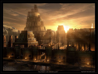
3d software is ofcource not the only way of creating cocnept art, some artists go for a full digital painting or a mattepainting as shown below. Mattepaintings are essentialy photomontages mized with digital painting, it verys greatly between artists of how much is hand drawn gitially and how much is altered photographs. The two images below are primarily digitaly painted with some photographs merged in to add texture.


Here is a classic example of a full mattepainting, it offers the oppurtunity to create an environement that could never exist is reality but at a photorealistic quality, more so than could ever be ahcieved with a 3d generated environment.


Here is a link to his website with a in-depth look at the processes he took to create this matte-painting:


Video Game Concept Art

Video game concept art is also of interest to me, going through the various processes to formulate a character or vehicle is a very interesting and rewarding process.

Not only would this be an interesting project to test my skills of imagination but also it would help greatly in improving my anatomical drawing.

The two main forms of concept art in video games are character/ve
hicle concept, Environmental concepts and Scenario concept. Character and vehicle concepts tend to usually have the style of sketches and further developed and coloured designs over a whit background, sometimes with notes made by the artist pointing out important factors.


Scenario based Concept art
This form of video game concept art is aimed at showing characters and vehicle design in their appropriate context, such as in an environment to form a battle-scene. Sometimes these are shown to the game makers themselves, to push them further to attempt to match the quality/atmosphere on the concept in the game itself.

With this type of video game concept art style differ. Sometimes there simple digital speed paints (bottom right) similar to the character/vehicle concepts and other times their very in-depth 3d illustrations (bottom left).


It would be very interesting to embark on a project to design concept art for a fictional video game of my imagination. And try out all three forms of video game concept art, Time constraints would probably lead to only being able to achieve 1 or 2 of those aims however.

Half Life 2 Concept Art

Looking Forward

Concept art

I’ve always aimed from the first year to implement at least one major 3d generated illustration project into one of the modules. Over the past 4-5 years I have been learning the software and now I’m relatively confident that I can use it to its full potential and be able to create a illustration of the quality to be placed in a portfolio.

Characters for me are difficult to create through 2 dimensional artistic techniques, creating them in 3 dimensions is 100x harder and takes a great deal of time (which wouldn’t suit the tight deadlines of the module).

3D Environmental Concepts.

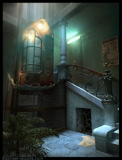
Raphael Lacoste is an artist that always come to mind when I think about 3d environment concepts. In recent years he’s more of a matte painter than a 3d environment artist, but his work in the 2000-2007 was purely 3 dimensional environment concepts for videogames.


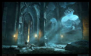
From looking at his environment concepts it is obvious there is a lack of characters, this leads to question whether these images are telling a story and in-turn are they illustrations at all? Personally I believe images such as these do tell a story and that a lack of characters doesn’t detract from that. When I see the bottom right image I can see a lot of things; what happened in to this building? What caused that lantern to fall and those stones to collapse on the roof? Was there a battle or a landslide from the mountain? These images make you imagine yourself what happened instead of giving everything on a silver platter, as a result everyone interprets the image differently.

Constraints of such a project

Time is the greatest constraint of this sort of project, 3d artwork often takes longer to create than 2d artwork for the simple reason that everything has to be created in 3 dimensions. As a result I may have to constrain the environment to be prominently manmade structure because authentic organic landscapes such as grass, foliage etc also takes a great deal of time.


Often in 3d art the final piece is just one flat render, and texture applied to most areas of the 3d object/environment isn’t even visible on the final render. So in a sense to save time I could only texture and model aspects that would be visible in the final rendered image.

James and the Giant Peach - Front Cover Design

The main inspiration i drew from at the start of this project was the work of victorian illustrator Arthur rackham. He uses watercolour and inked lines to create beautiful tracitional illustrations.


Below are two pages on initial sketches I made into the composition of the final piece. Originally (left part of image) I aimed at showing the exterior of the peach in mid air carried array by hundreds of seagulls from the hungry sharks below. This would have made a nice image but it would however not effectively show any of the characters as they are too far away and almost silhouette in appearance.

This led me to think of a way of showing all the major characters clearly, most covers show characters on the outside of the peach so i attempted a different approach with an interior scene of the peach.


Due to time constraints and the fact that i already new what style i wanted in the final peice i went straight into tjhe final production.


Issues

One major issue during the final production was an issue of detail and resolution that occurred with the line work in stark comparison to the sharpness of the watercolour texture. Because I scanned the original line work and then laser printed it onto a3 where it was painted I effectively was degrading the quality of line work and further degrading it with the final scan of the painted version. To overcome this issue I applied various sharpening techniques on Photoshop including smart sharpen and paint dabs.

Adjustments that need to be made

The first adjustment that needs to be made is for the main 'James' character to be anatomically correct, his neck is too wide and long; also his left arm is tiny in comparison to the right.

The main title text could also be aligned to the right to coordinate with the diagonal shape of the peach coloured gradient.

Steam Powered Aero-Plane!


Steam Powered Aero-Plane

I couldn’t possibly turn down the opportunity to illustrate a steam-powered aeroplane because anything that is unnaturally power.

Blunts Steam aeroplane was listed in the yellow book of text in the Edwardian Inventions page. HOWEVER I could not find any information on the inventor blunt nor his steam powered flying machine.

Due to this a dilemma appeared, I had to invent my own steam plane design rather that an artistic impression of the one listed in the yellow book of text. I found a great deal of information and photographs of real steam planes that existed and this provided solid ground for designing my own steam aero-plane.

Using reference of environments I began creating colour and environment tests through the use of very quick small-scale speed paintings using Corel Painter and Photoshop.


Originally I had hoped that the entire illustration could be painted in 2-3 hours to coincide with the speed painting aim I set in the statement of intent. However I couldn’t leave it in the state it was above, so I added much greater detail to all areas and as a result improved the image dramatically. The time taken to create the final image was around 5-6 hours.

Further Alterations required
The first thing I want to alter before I can consider this piece for a portfolio is to increase the detail in the foreground hills, the area where the two white rocks lie on the left hand side lacks detail and the grass texture looks a little repeated.

I also want to tweak the plane, such as more shadows, texture and wires fixing the wings together. Majorly I forgot to add in the actual engines! So that is a priority when i begin further work again on this peice.


Museum of Moustashes

Below shows the briefly the processes taken to reach the final piece (right image). Because of the very unusual panel shapes at the top I had to formulate my own text by hand drawing it as shown on the left image.

Similarly to the editorial I attempted to go for a slightly cartoony look in the way I drew the line work and the way I applied could in a simple cell shaded manor. The primary concern that presented itself was that a lot of negative space was present around the lettering and central image, as a result I had to improvise so I gathered various Edwardian patterns, live traced them and placed them around the border areas of the poster.


Further Alterations
The most important alteration I want to make to this piece before I consider it for the portfolio is to re create the pattern in the background of the poster. This way I wouldn’t be plagiarizing someone else’s pattern design and I could custom shape the pattern more effectively around the lettering and central image.

The font curved around the central illustration is also warped in certain areas, due to the curve modifier I added on Photoshop. Placing each letter by hand or using the tools on in design rather than Photoshop should be able to over come this issue.

Editorial

I’ve been a fan of Scott Kurtz work, a web comic artist seen to be the 'father/creator' of the web-comic genre. I’ve always wanted to create a web-comic style illustration but have never had the opportunity or brief that could make best use of that particular art style until now. It’s interesting to see how he creates his artwork, which can be seen on live drawing sessions most days.


Naturally I started out with initial drawings, developed ideas and then the final piece. Below is a visual timeline of the steps I took create it, and below that is the final piece itself.


Further Alterations that will be made in the future
The main aspects that need resolving on the image itself are the central two characters (scientist and passenger in yellow T-shirt). The cartoony look of these two characters does not match the slightly realistic look of the passengers in the background, for continuities sake these aspects could be changed.

Monday, 29 November 2010

Furhter summer work included the Edwardian Invetion, the Ornithopter. An invention listed in the yellow book of text allocated to us.

I decided to go with a different style of illustration for this one, making use of 3d generated software '3ds max'.


Creation Process

Before a render the illustration was a series of mathematical lines, rendered in real-time in a very simple optimised form:


Here is a comparison between renderers, on the left is the superior 'Vray' rendered image and on the right is the inferior default 'Scanline' render.